nerix.ai brand guide · version 1 · 18 October 2026
The Speed N
Answers you can check.
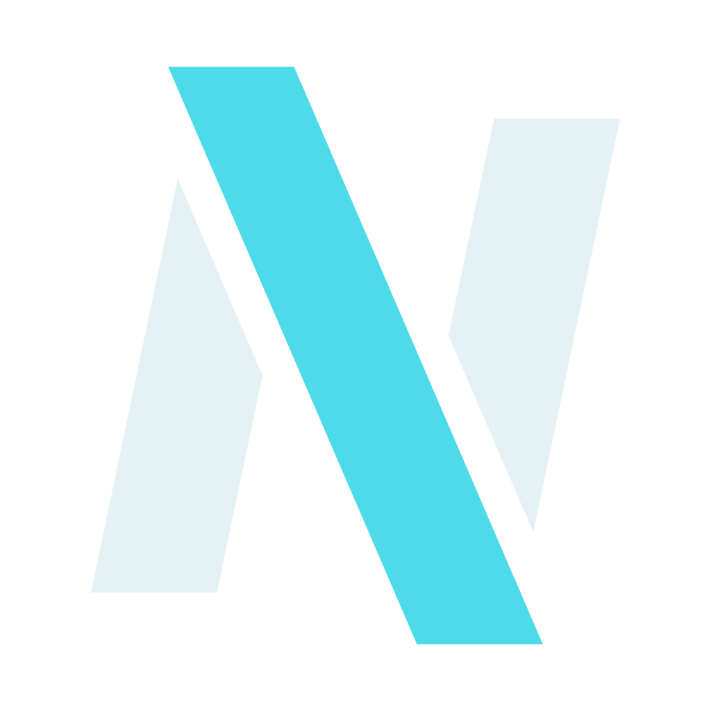
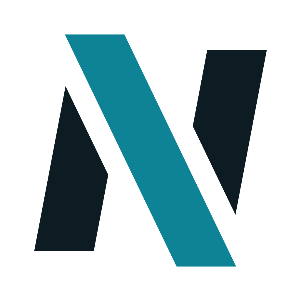
A capital N leaning into motion. Its diagonal is a slash of Ice, the colour nerix uses for everything AI does. Everything on this page is generated from one geometry file, so the files below always match the product.
Download the brand kit · zip, 735 KB01 · Mark
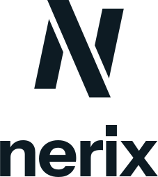
One letter, three shapes, one gap
The mark is drawn on a 48-unit grid from three quadrilaterals: two stems and a slash. The slash runs along the N's own diagonal and past both stems by the same amount. Where it crosses a stem, the stem is cut back by one even gap, so Ink and Ice never touch. The whole letter leans forward about 12 degrees.
Construction on the 48-unit grid. Stems 8.5 units, gap 2.2 units, lean 11.9°, overhang 3.5 units of height at each end.
Full geometry above 24 px; the small geometry (heavier stems, wider gap) at 24 px and below, so the cut survives at favicon size.


02 · Logo
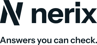
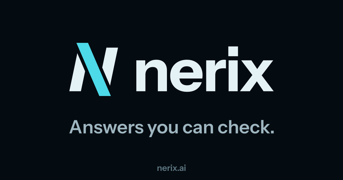
The mark with its name
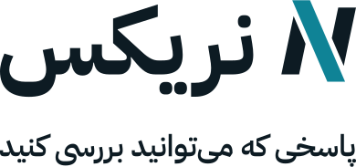
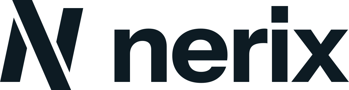
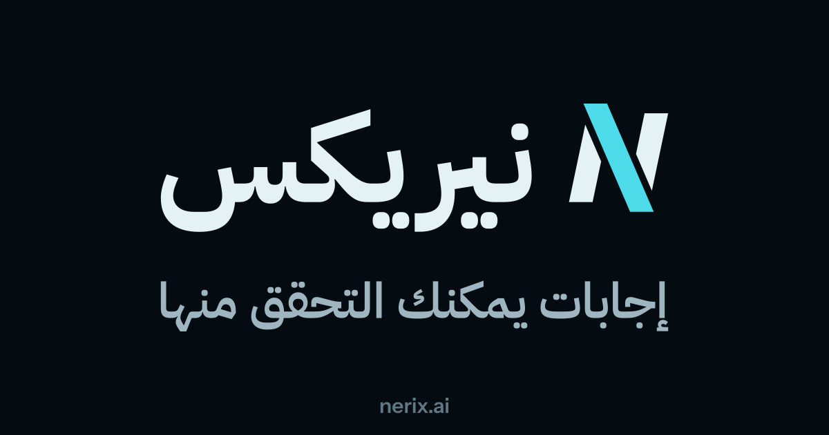
The wordmark is drawn from Instrument Sans Bold. In the horizontal lockup the stems stand at the wordmark's cap height and the gap between mark and name is 0.42 of it. Use the domain lockup where people need the address; ".ai" takes Ice. In Arabic-script layouts the name sits on the left and the mark on the right; the mark itself is never mirrored.

03 · Space and size
Room to breathe, and the smallest it goes
Clear space: at least one stem width on every side, measured from the ink. Nothing else enters this area.
| Use | Minimum |
|---|---|
| Mark alone | 16 px (small geometry up to 24 px) |
| Horizontal lockup | 96 px wide |
| Lockup with Arabic name | 120 px wide |
| "Powered by nerix" badge | mark 16 px, text 11 px |
| mark 6 mm, lockup 25 mm |
04 · Colour
Ink and Ice
Two roles. Ink is text and the mark's stems. Ice is the brand colour: primary actions and links, and everything that means AI, from the mark's slash to citations, live activity and focus. Neutrals are cool and lightly tinted towards Ice. Every pair below was measured; text pairs reach 4.5:1 and marks reach 3:1 in both themes.
| Pair | Ratio | Needs |
|---|---|---|
| Ink on Paper | 16.88 : 1 | 4.5 : 1 |
| White on Ice (buttons) | 4.85 : 1 | 4.5 : 1 |
| Ice as text on Paper | 4.83 : 1 | 4.5 : 1 |
| Slash on Paper | 4.34 : 1 | 3 : 1 |
| Frost on Night | 17.27 : 1 | 4.5 : 1 |
| Ink on Ice Bright (dark buttons) | 10.79 : 1 | 4.5 : 1 |
| Ice Bright on Night | 11.74 : 1 | 3 : 1 |
| Slash on the Ink tile | 10.43 : 1 | 3 : 1 |
05 · Type
Instrument Sans and IBM Plex Sans Arabic
Answers you can check.
Instrument Sans · Latin, the brand face; the wordmark is drawn from its Bold. Variable weight 400 to 700.
إجابات يمكنك التحقق منها
IBM Plex Sans Arabic · Arabic, Persian, Pashto and Urdu. Listed second in every font stack, so a Latin file name inside Arabic text keeps the Latin face.
Code and figures use a monospace face (Geist Mono in the product). All three are open-licence (SIL OFL).
06 · Motto
Answers you can check.
Four words that say what nerix does differently: every answer shows its source. Translations are by meaning, and each still needs a native speaker's review before print.
| Language | Motto |
|---|---|
| English | Answers you can check. |
| Español | Respuestas que puedes comprobar. |
| Français | Des réponses que vous pouvez vérifier. |
| العربية | إجابات يمكنك التحقق منها |
| فارسی، دری | پاسخی که میتوانید بررسی کنید |
07 · Tool family
One N, a colour per tool
Every nerix tool uses the same mark on the Ink tile; only the slash changes colour. A new tool gets a new slash colour, never a new shape.
08 · Icons
App icons and favicons
App icon: the Ink tile, mark at 58%. iOS gets an opaque 1024 px square (plus dark and tinted); Android gets adaptive layers with the mark inside the 66 dp safe zone.

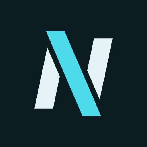
Favicon: the small geometry on the Ink tile. The SVG favicon switches to light stems in dark browser themes.

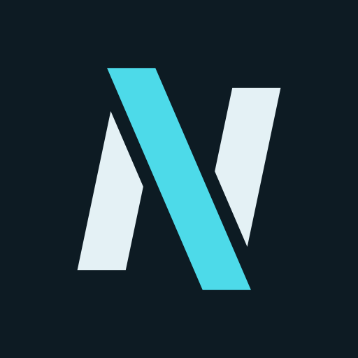
Email (BIMI): SVG Tiny P/S, square, solid background, the mark inside the round crop mail clients apply.
09 · Motion
The streak
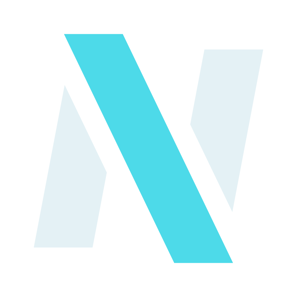
While nerix works, light runs down the slash in its pen direction, lands, and drains, with a dimmer afterglow behind it. The stems never move: Ice moves, Ink holds. Boot screens assemble the N once first; an answer being written draws the N in pen order. Under reduced motion nothing travels and the slash breathes instead. The same curves drive the transitions between screens and every piece of film: sting, end card, title cards, lower thirds and wipes.
On dark: Frost stems, Ice Bright light.
On light: Ink stems, Ice light.
On the tile: the app's avatar while it works.
10 · Misuse
Please don't
- Never let Ink and Ice touch: the gap is part of the mark.
- No sparkles, wands, robots or glowing orbs next to it; the brand says AI through Ice and motion, not clichés.
- No dashes in titles that carry the name: use "nerix | Page".
- Never redraw the mark: use these files or brand-paths.ts in code.
11 · Downloads
Every file
Everything below is also in the zip.
Download the brand kit · zip, 735 KB